
A Lesson in Colour Drenching Your Home
Colour drenching is having a resurgence for 2025. Here’s how to utilise this maximalist method to take your rooms to the next level
Read more
A Lesson in Colour Drenching Your Home
Colour drenching is having a resurgence for 2025. Here’s how to utilise this maximalist method to take your rooms to the next level
By: Charlotte Olby
When thinking about home decor trends it tends to be a pattern, print or texture that is having a moment. Rarely is there a trending moment for the use of colour. But if 2025 isn't already surprising enough, colour drenching has entered the chat to teach us all a lesson in playing with tones and shades in order to elevate our homes to maximalist stature, minus the heavy print. There’s no doubt about it – colour drenching is the trend to watch.
So what is it? Originally coined for the painters and decorators among us, colour drenching is the art of taking one colour and quite literally drenching everything in your room - from your walls to your woodwork – in that colour. But not in a matchy-matchy way, rather than going for everything in the exact same shade, you need to think tonal. And if you’re truly committed, you can take the colour (or various tints and shades of it) through to your soft furnishings and décor to create a monochromatic interior scheme. On board yet? You will be.
Read More: How to Mix Pattern with Colour
How to Master Colour Drenching
First, you want to consider the effect of colour on each room, and the mood of everyone residing within it. For instance, a soft pink can work instantly to lift moods with a subtle glow that radiates from the walls, while natural tones of brown and beige can bring a sense of cocooning calm. Consider the room in which you’re scheming not just in terms of decor but also feeling, too. For instance, if you want to create a guest bedroom that feels tranquil and serene – opt for a soft ink-y blue – but if you’re looking to liven up an at-home bar or gym, perhaps surround yourself with more vibrant colours to inspire. It’s important to choose colours that speak to you. Before making your final decision, paint out some samples to see the effect of the light in your room on the colour. South-facing rooms can make colours feel warmer and more intense, while north-facing rooms can make rooms feel cooler so it’s best to use warmer tones to balance this out.
Hot Pink = Passionate & Driven
Orange = Bold & Bright
Red = Vibrant & Confident
Baby Pink = Creative & Calm
Purple = Soft & Dreamy
Blue = Tranquil & Brave
Green = Open & Gentle
Once you’ve decided on the correct shade for the room, use it on walls, woodwork and even the soft furnishings – well and truly going against the 60-30-10 rule. But, by diverging so far from this (unwritten) rule, colour drenching certainly works to make a bold statement and adds instant drama. Using this method of painting blurs the boundaries between the walls and ceiling, disguising any stark lines and eliminating contrast to make your room feel larger and more cohesive. For example, if you’re planning on painting a room in a dark blue with white ceiling or woodwork, the blue will appear more imposing when in contrast with white. But a room drenched in blue from top-to-toe will make the blue appear softer as your eye doesn’t register colour in isolation. Remember that colour is for everywhere, not just walls. Transform with instant impact by adding soft furnishings in the same palette and dial up your styling with a host of colourful home accessories. There's only one rule: remember to separate areas of pattern so that the room doesn’t feel too busy.
Here’s how to embrace colour in 2025, the Liberty way…
Ink Blue
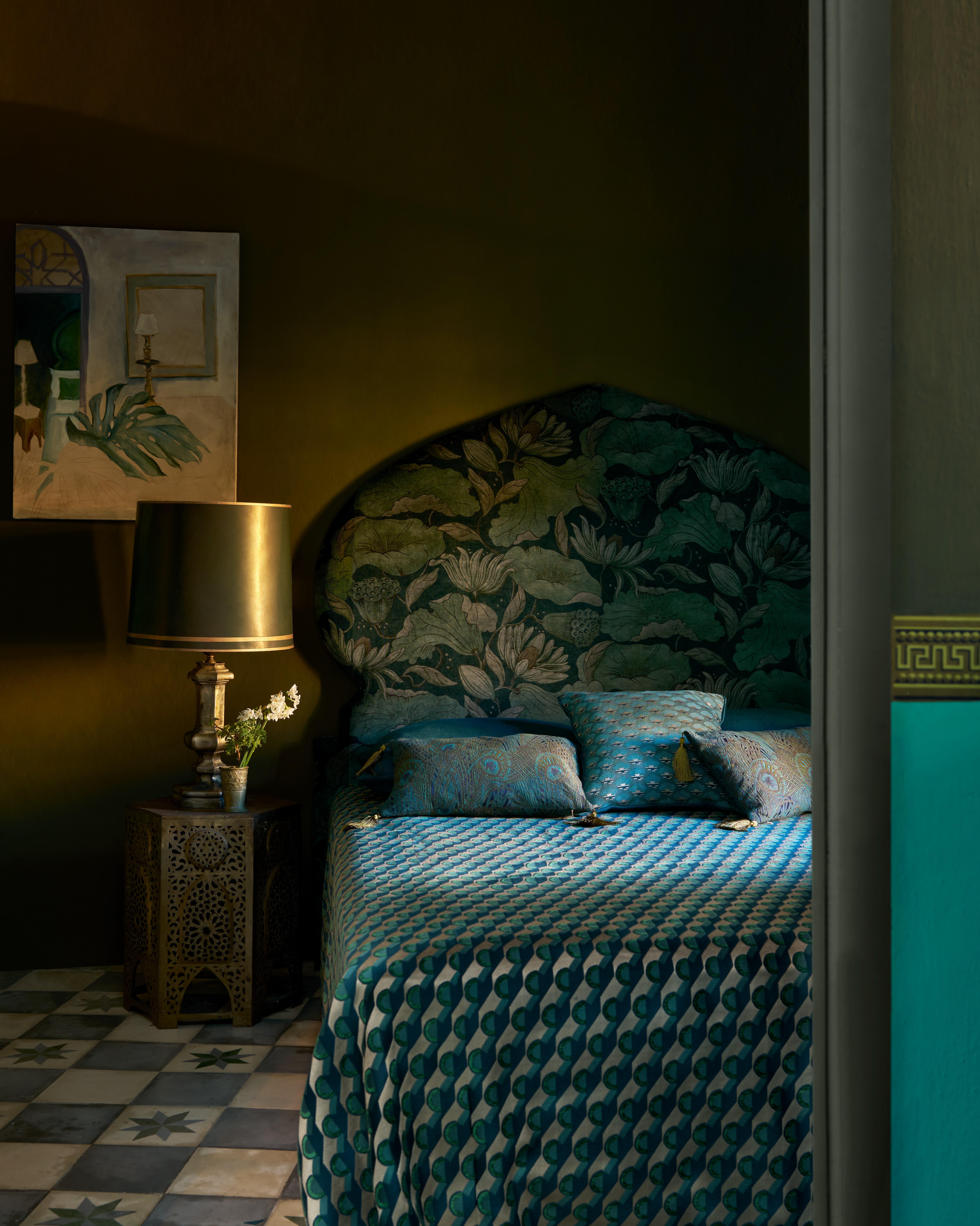
The House of Liberty
Blue is readily considered one of the best colours to decorate with. And the evidence speaks for itself. Blue is believed to relax the mind and slow down heart rate, metabolism, blood pressure, and hypertension – so it makes sense that it's seen as an indicator of security and serenity. While darker shades such as royal blue and primary colours work great in a kitchen or formal living room, a combination of more muted forget-me-not tones will help to encourage a good night’s sleep in your guest bedroom. More aquatic shades of blue might even have a healing effect on the mind as it reminds us of the sea and swimming pools, making it a great choice for relaxation spaces. When you implement a monochromatic treatment in a room, the lighting becomes an important feature – particularly with darker aesthetics so be sure to bear light layering in mind and work with at least three sources: overhead, wall and table or floor level.
Read More: The Most Calming Colour Palette: Blue and Grey Living Room Ideas
Shop Now
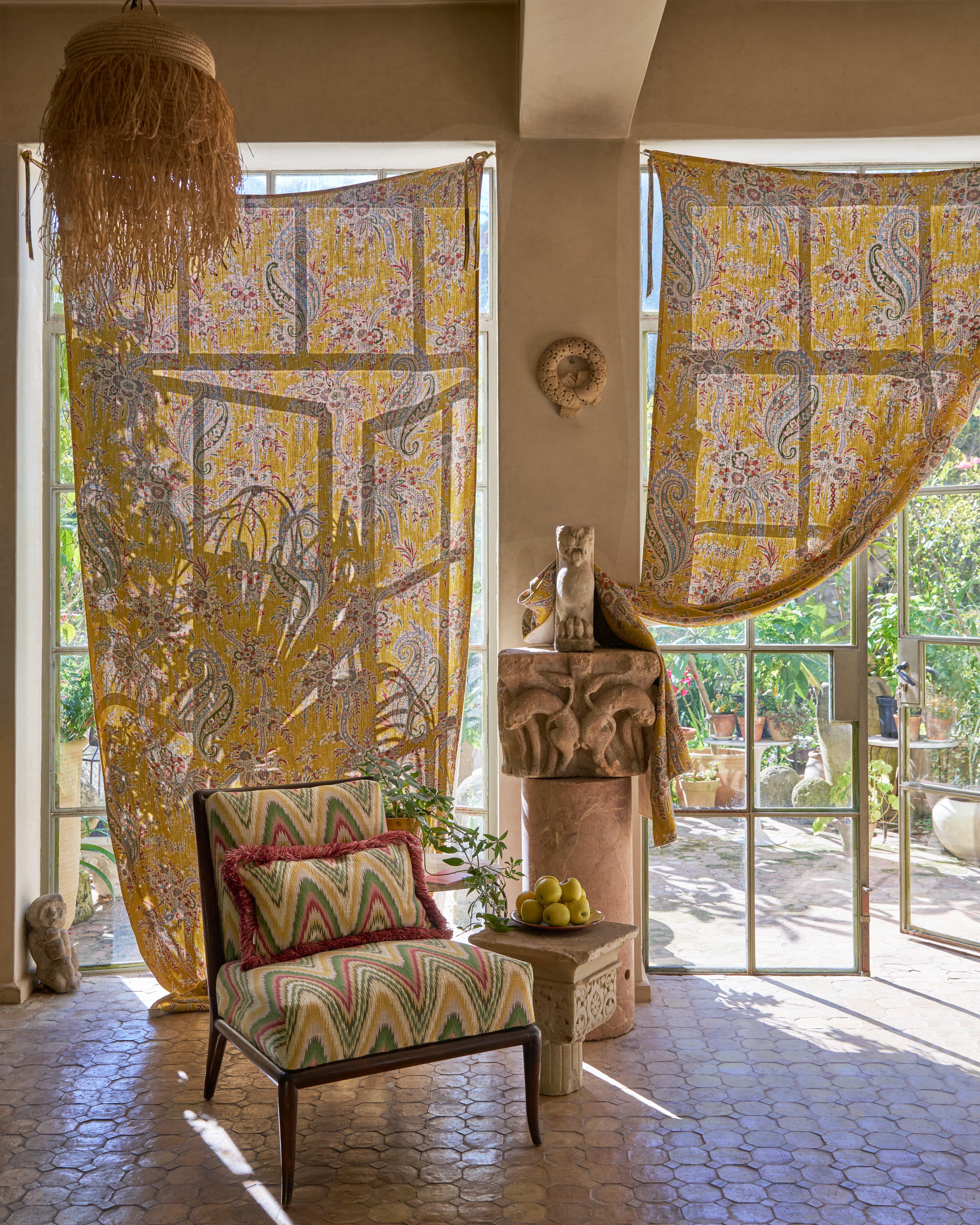
Ochre Yellow
Curtain: Liberty Interiors Palm Willow in Fennel, chair and cushion: Bombazine in Lichen
While buttery tones are having their time in the spotlight, most shades of yellow are believed to have a positive effect on the psyche – representing sunshine, freshness, energy and prosperity. Due to the extreme optimist nature, a fully yellow drenched hallway will provide an instant first impression to anyone who crosses the threshold, automatically making your home appear brighter and sunnier, even on a dull day. In interior design, yellow is often recommended for kitchen, dining areas and bathrooms and is best kept away from areas like bedrooms where you wish to unwind. Find rhythm in the colours in your space by picking a base shade, drenching it across walls and woodwork and adding flashes of accent tones in your decor items.
Read More: Be Our Guest: Guest Bathroom Ideas for Overnight Hosts
Shop Now
Rust Red
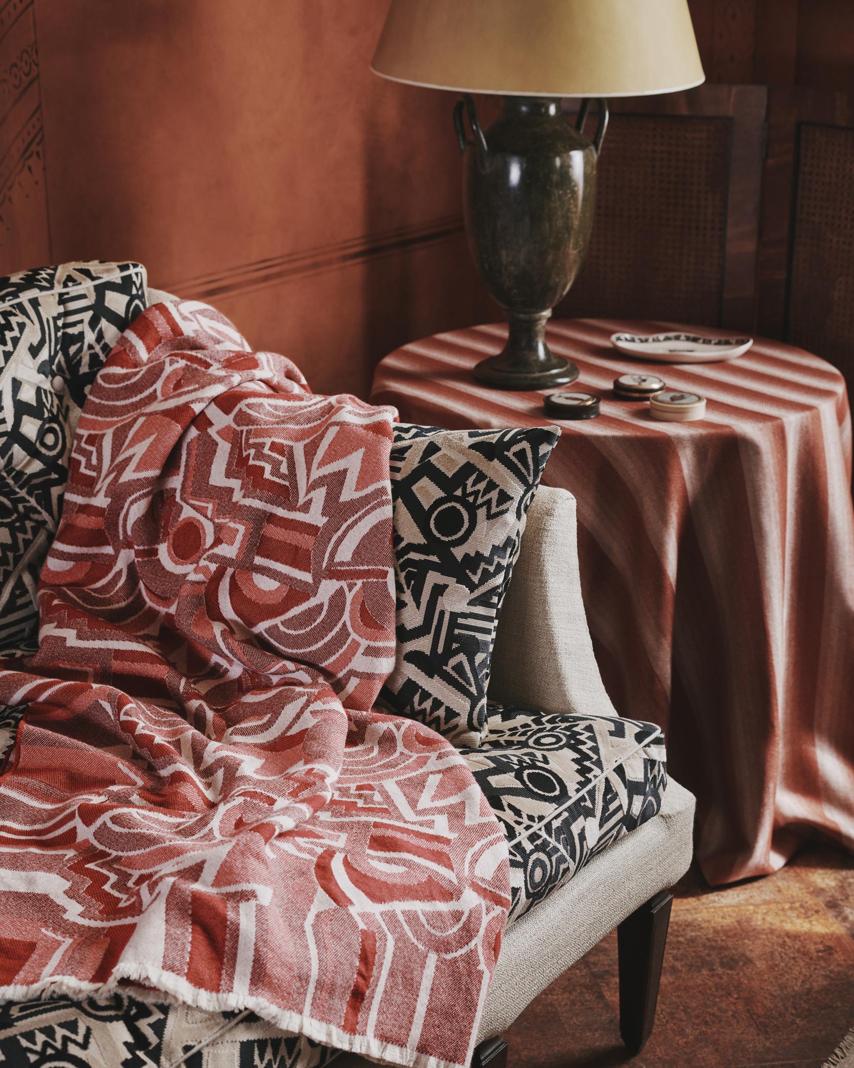
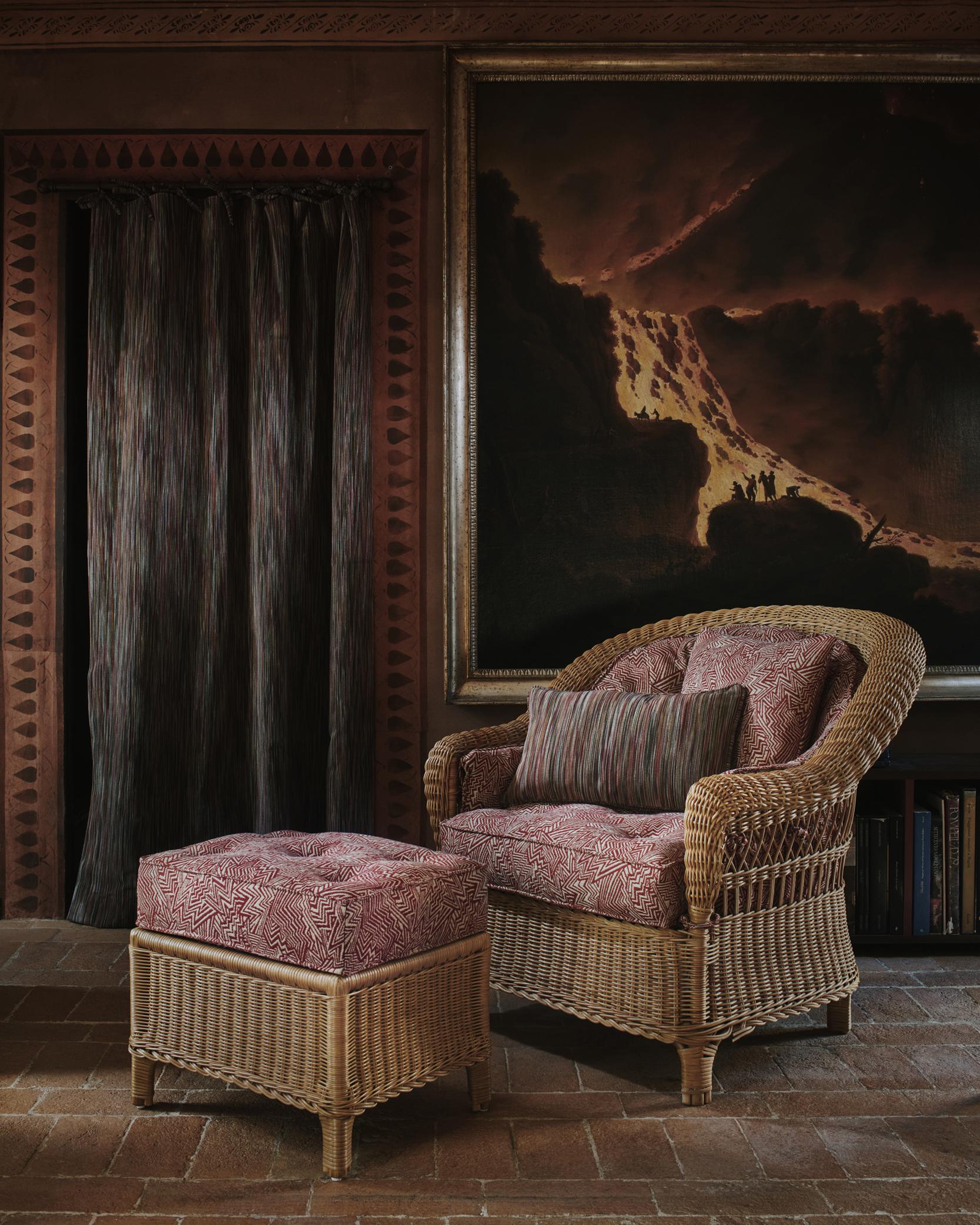
Often getting a bad rep, red is the most vibrant shade to add to your colour scheme. Whether you choose dark shades like burgundy or opt for postbox red for vigour, red in its entirety will inspire passion, energy and strength – making it best suited for design plans that require a little excitement. Often used in offices or the living room, red inspires high energy and leadership, helping to stimulate conversation for any manner of at-home hosting. Is your bedroom feeling a little lacklustre? It’s no secret that you can utilise red to kindle feelings of love and desire. A more accessible approach to colour drenching is to tone things down by using different shades of the colour you choose. The closer the tones, the bolder the feel. Rust reds will pair harmoniously with chocolatey-browns or warm terracotta for a subtle colour drenching effect without jumping into the trend head first.
Read More: Trend-Led Decor Ideas to Upgrade Your Living Room
Shop Now
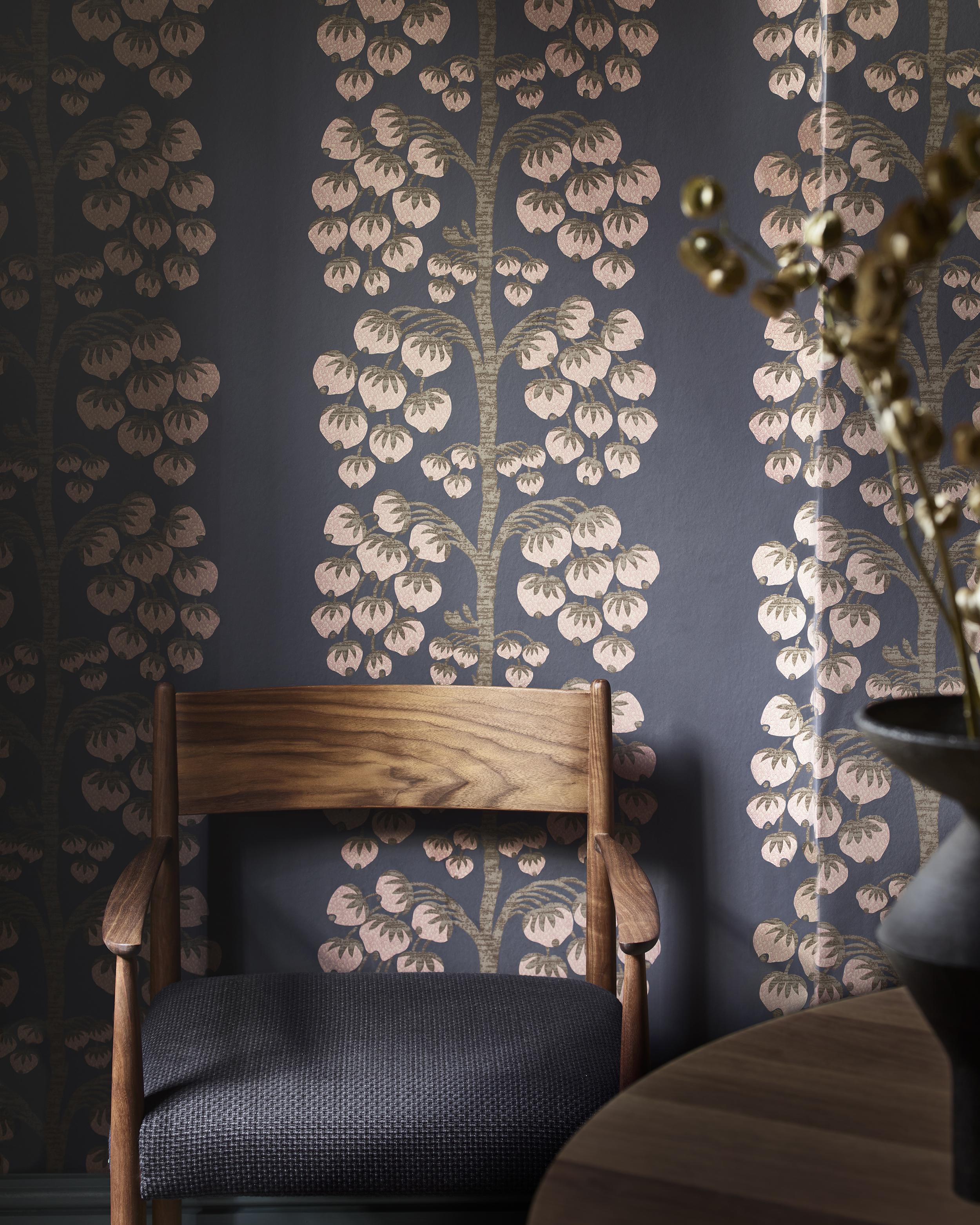
Moss Green
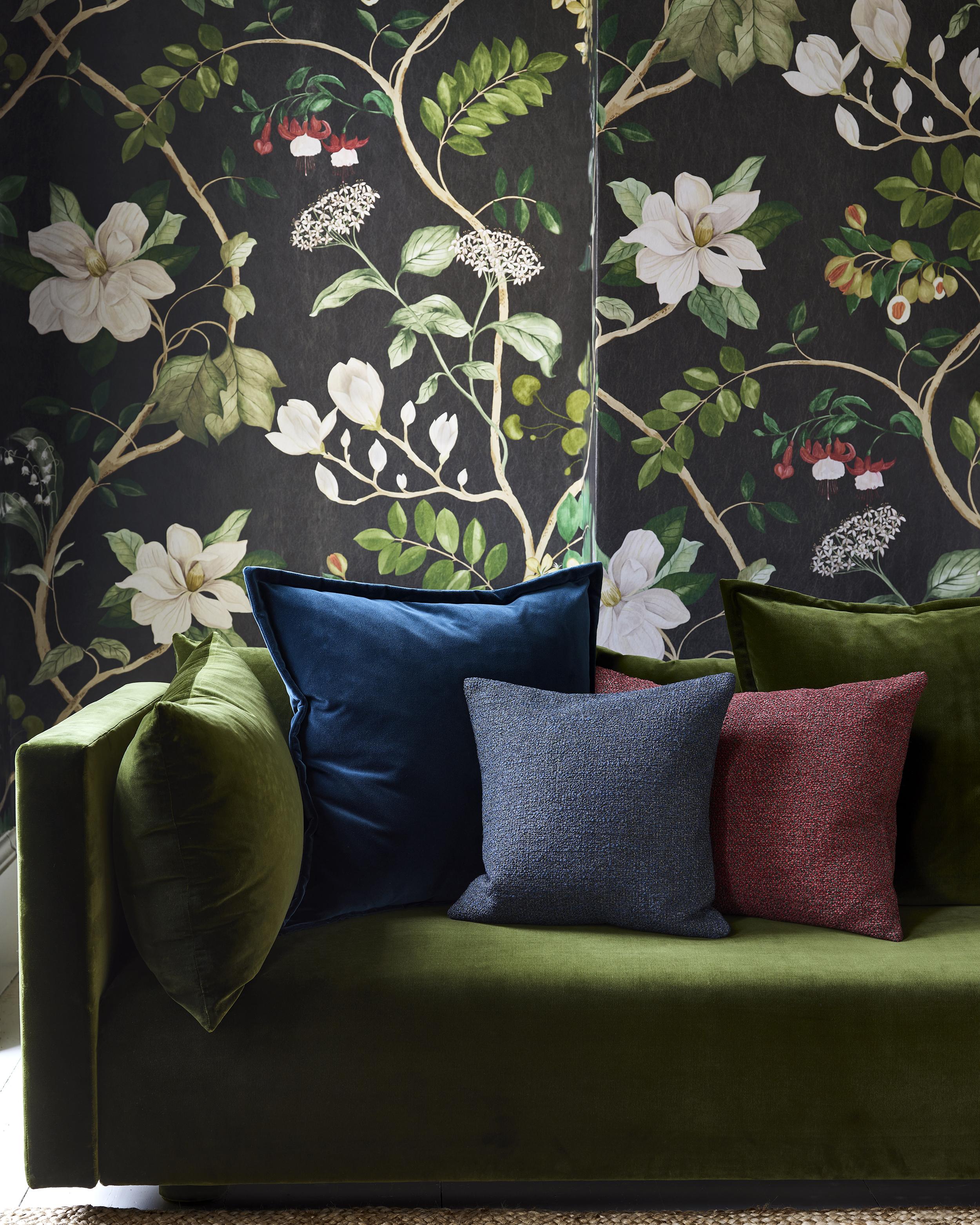
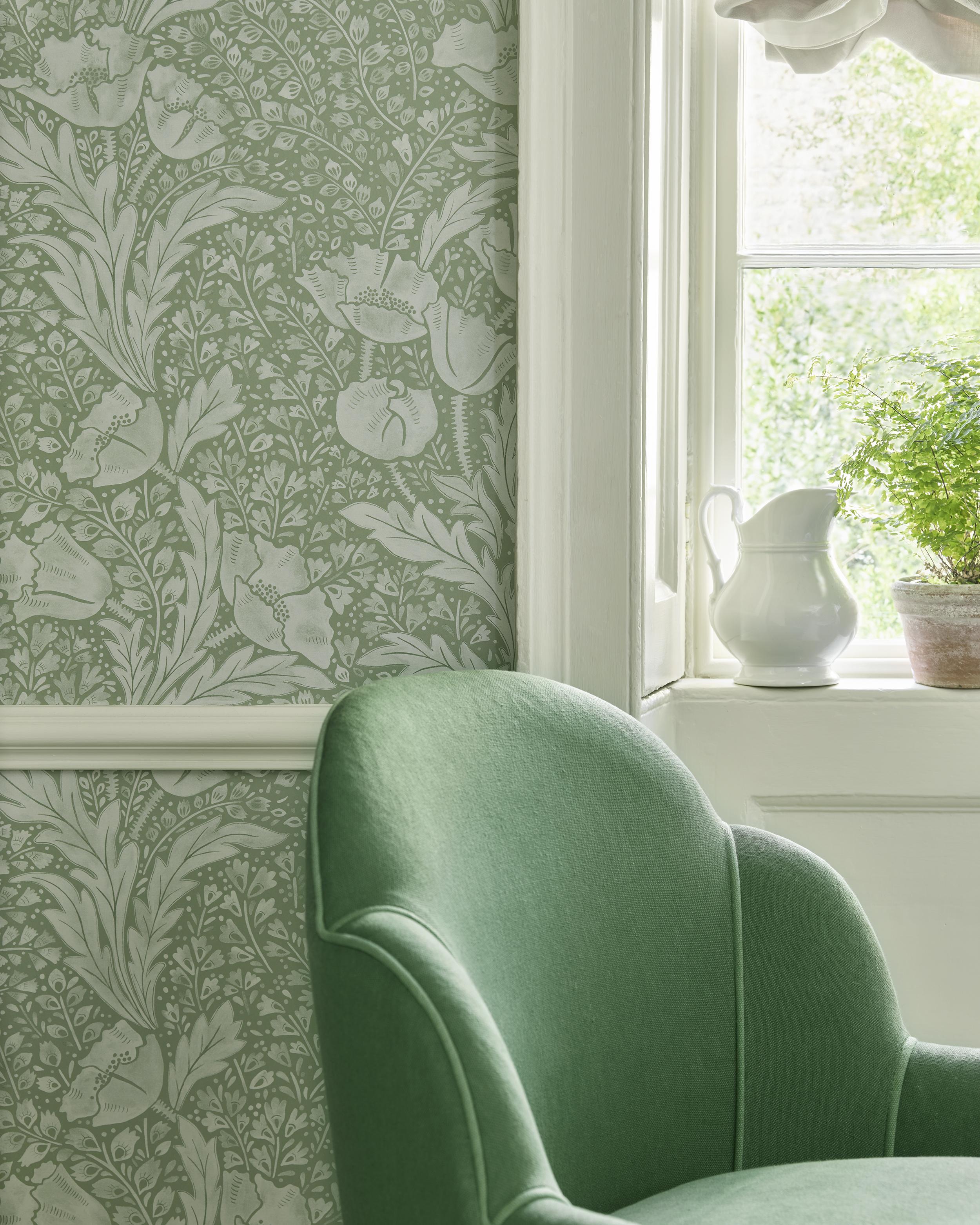
Naturally, when we see the colour green, we think of the great outdoors. Associating the shade with freshness, peace, and trust – making it quite the powerful colour in interior design. Different shades of green can promote a whole variety of emotions for your spaces. While light and aqua green are considered to be more calming, dark green can be associated with sophistication and olive green is recognised for bringing harmony. Colour drenching works equally well in both modern and traditional homes – it can be a smart way of making a room with period features feel more contemporary by changing the focal point of a space. When a room is predominantly one colour, natural and artificial light plays a role in drawing attention to certain elements. When the whole backdrop recedes, any object – from furniture to cushions – takes more of a central role.
Read More: Green Living Room Ideas to Soothe the Soul


?fmt=auto&qlt=default&metadata=true$poieg$&w=1000&h=1300&sm=c&poi={$this.metadata.pointOfInterest.x},{$this.metadata.pointOfInterest.y},{$this.metadata.pointOfInterest.w},{$this.metadata.pointOfInterest.h}&scaleFit=poi)


?fmt=auto&qlt=default&metadata=true$poieg$&w=1000&h=1300&sm=c&poi={$this.metadata.pointOfInterest.x},{$this.metadata.pointOfInterest.y},{$this.metadata.pointOfInterest.w},{$this.metadata.pointOfInterest.h}&scaleFit=poi)


?fmt=auto&qlt=default&metadata=true$poieg$&w=1000&h=1300&sm=c&poi={$this.metadata.pointOfInterest.x},{$this.metadata.pointOfInterest.y},{$this.metadata.pointOfInterest.w},{$this.metadata.pointOfInterest.h}&scaleFit=poi)


